

Revised 03/13/2026
This is a comprehensive guide for GOapply administrators building phases in the Advanced GOmanager/Form Editor.
If your phase was built prior to August 28, 2025, it will open in this Advanced Form Builder. New phases built after August 28, 2025, will open in Simple Form Builder. For more information on Simple Form Builder, please reference this Knowledge Article.
GOmanager is a subset of our software that allows management to access and edit GOapply phases as well as impersonate GOapply and GOfund users. Form Editor is specifically the tool used to build the GOapply (and GOapply Reviewer) phases.
If you’ve read our GOapply Administrator guide, you will know how to create a new opportunity and phase(s) from akoyaGO CRM. If you haven’t done that, go back and read about it in the GOapply Administrator Guide.
Launch Form Editor from Phase
Creating forms for your applicants to fill out in the GOapply UI is done in the GOmanager Form Editor. From a Phase record, there is a tab called Form Editor. Open that tab and click Launch Application Form Editor to begin building the form for the Phase.
You will also see the Transcript and Recommendation Form Editors below the Application Form Editor. These are used for Third Party Response phases (mainly scholarships). This document will focus on the Application Form Editor. For information on Third Party Response phases, please reference the GOapply for Third Party Responses Admin Guide.
As mentioned above, after the August 2025 release, if you launch the Form Editor for a new phase, it will open the Simple Form Builder. For more information on Simple Form Builder, please reference GOapply Simple Form Builder. The rest of this Knowledge Article is only relevant if you are working with a form built prior to August 2025 or if you have converted to Advanced Form Builder!
Form Editor - Advanced Form Builder
Let’s first take a tour of the form editor.
*Note: if the phase you are trying to edit is part of a published phase, editing is not supported. You will see the following note. Unpublish the opportunity and reopen Form Editor.*
At the top of the page, you will see the name of the phase (opportunity) and the name of the phase.
Under the phase name, you’ll see three tabs called Form Designer, Test Form, and JSON Editor.
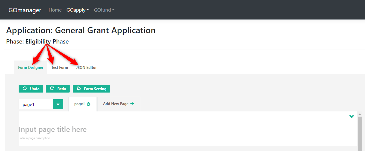
- Form Designer is where you will design the form (drag and drop fields, name fields, and determine field settings).
- Form Setting: You’ll see a button with a gear icon labeled Form Setting. Click this button to edit the form (phase) settings as a whole. You will edit the settings in the properties section described below.
- Test Form is where you can test the form that you’ve built. Here you can test that hidden fields are hidden, that required fields are required, and that formatting for phone numbers or email addresses functions as desired. Show invisible elements: check the box to see hidden fields. Choose device: select an option to see how your phase will display on different screens.
- JSON Editor: This tab displays the phase in JavaScript Object Notation (JSON) format, which can be useful if you are comfortable reviewing JSON. If you are not familiar with JSON, all required configuration can be completed using the Form Designer tab, and the JSON Editor is not needed.
Please note that the JSON Editor tab is intentionally set to read only. Editing in the JSON Editor tab is not supported, as it may cause JSON corruption. This tab is intended solely for viewing the phase in JSON format; all edits should be made in the Form Designer tab.
Toolbox/Properties:
- Toolbox: On the right side of the screen, you will see a panel called Toolbox. This is a list of all available fields for that page.
- Properties: Properties correspond to the field that is selected. This is a way to drill down into field-level settings. (Or form settings if that is what you have selected.) More information in the Properties section below.
Prior to August 2025, when launching the Form Editor for a new phase, it was pre-loaded with Applicant, Payee, Primary Contact, High School, and College dynamic panels with fields loaded into those panels as well. Because new phases will now launch in Simple Form Builder, you will no longer see these pre-loaded dynamic panels. However, if you are working from a phase created prior to August 2025, the following information may be relevant for you, as the pre-loaded panels were included when the original phase was built.
The panels and fields will be pre-mapped to the respective fields on the request. These panels can be deleted if you find no use for them. We will talk about dynamic panels later in this document.
Below is listed how each pre-loaded panel is mapped and other pertinent settings included:
Applicant: panel mapped to request entity, applicant field (create new if not found = ON)
Name of organization: constituent name
EIN: constituent, tax id (this is the lookup field, the record’s unique identifier, meaning if this EIN entered is not found in the CRM, it will create a new constituent and map these fields there)
Street 1: constituent, address 1: street 1
Street 2: constituent, address 1: street 2
City: constituent, address 1: city
State: constituent, address 1: state/province
Zip Code: constituent. address 1: zip/postal code
Institution Type: constituent, institution type
Website: constituent, website
Phone: constituent, main phone
Payee: panel mapped to request entity, payee field (create new if not found = ON)
name of organization: constituent, constituent name
EIN: constituent tax id (lookup field)
street 1: constituent, address 1: street 1
street 2: constituent, address 1: street 2
city: constituent, address 1: city
state: constituent, address 1: state/province
zip code: constituent, address 1: ZIP/postal code
institution type: constituent, institution type
Primary Contact: request, primary contact (create new if not found = ON)
first name: contact, first name
last name: contact, last name
job title: contact, job title
email address: contact, email address (lookup field)
preferred phone number: contact, mobile phone
High school: request, high school (create new if not found = ON)
name of organization: constituent, constituent name (lookup field)
city: constituent, address 1: city
state: constituent, address 1: state/province
zip code: constituent, address 1: zip/postal code
institution type: constituent, institution type
College: request, college (create new if not found = ON)
name of organization: constituent, constituent name (lookup field)
city: constituent, address 1: city
state: constituent, address 1: state/province
zip code: constituent, zip/postal code
institution type: constituent, institution type
Name and Title
A quick note on the difference between Title and Name: You’ll notice that Pages and Fields ask you for their Name and their Title. The Title is applicant-facing information. It will appear on the phase. If the title is blank, the name will be used on the phase. The name is used for developing the logic of your phase. You’ll use Page and the field Names when building a phase that uses conditional logic.
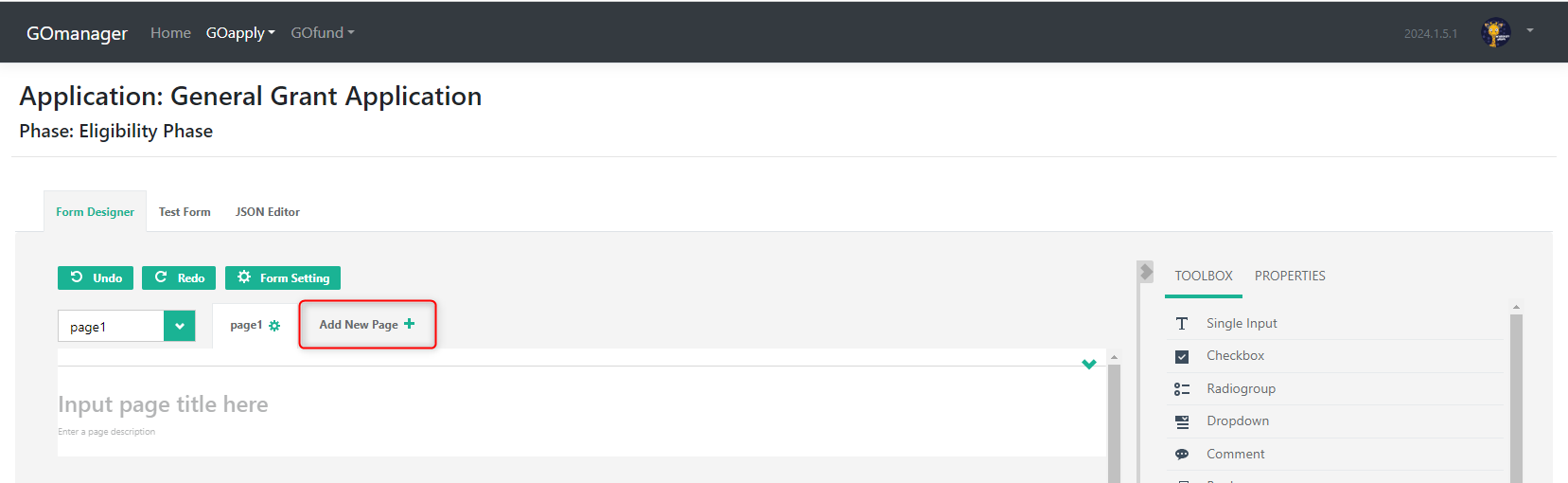
Pages
To add a page, click the Add New Page+ button. Give the page a name.
Fields
Add fields by dragging and dropping from the Toolbox. Once a field is dropped into the form, it can be edited in various ways. Click into the field to highlight your edit options.
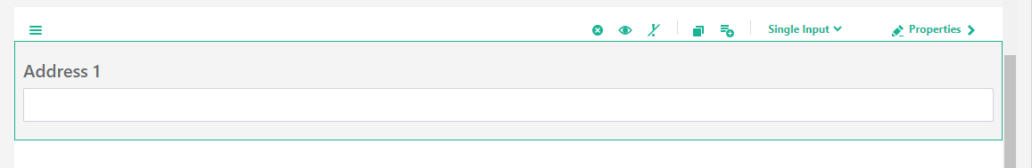
Above the fields are several icons. From left to right, you can:
- drag and drop the field to a different position on the form with the hamburger button (three horizontal lines)
- delete the field with the X button
- toggle the item's visibility using the eye button
- make the question required with the exclamation point
- duplicate the item
- add the item to the toolbox (quick add for future use in that phase),
- change to a similar field type, i.e., checkbox to radiogroup or single line input to comment
- open the properties for this field. Each field type will have its own properties panel. Some fields don’t have the same properties as others.
Field Types: An Overview
Here is a breakdown of the different field types in your toolbox.
Single Input: single line text. There are no limits on the input, so applicants may enter any text, however long.
Checkbox: This question type is used for questions where the applicant can select multiple options. This is the only question type that allows multiple items to be checked. Only the selected options are recorded in the PDF.
Example: What Social Media Sites do you use?
Radio group: This question type is used for yes/no questions, or any other boolean (two choice) questions.
When you map a Y/N question in GOapply to a field in akoyaGO, the question will default to radiogroup with the options from the field in akoyaGO. For unmapped questions, you can set the options in the question's properties.
Example: Do you agree to the terms of this grant?
Dropdown: This question type is used for multiple-choice questions where the applicant can choose only one option.
When you map a question in GOapply to a single-choice field in akoyaGO, the value options will populate based on the field. For unmapped questions, the options are set in the question's properties. *Please note the Value column in the question's properties must match the same options as the field in akoyaGO for mapped questions.
Example: Please select the group of people to benefit from this grant.
Comment: long form response. A text box is presented to the applicant. There are no limits on the input, so the applicant may enter any text, however long.
Image: allows an image to be uploaded or linked into the phase. This is not an image upload field for the applicant.
HTML: This is a rich text editor. Best practice is to type and format your text in the space provided. To make the text editor larger while you are editing, select the button to expand. It is not recommended that you copy and paste text from MS Word or any other text editor in this box, as it will cause issues with how your final PDF is rendered. 'Heading' font types are not supported.
Signature Pad: allows applicant input to be directly drawn on screen in a pre-set box or area. This is typically used to obtain a signature; however, it could be used to obtain any hand-drawn input. The box size can be changed by clicking the Properties tab. The pen and background colors can also be changed. The applicant's input is recorded in the PDF as JPEG, PNG, or SVG. This file format may be changed in the Properties tab.
File: upload file. Additional details can be specified within question properties, such as the maximum file size, accepted file formats, and the preview area. File formats are restricted by a comma-separated list of file extensions, including periods, e.g., .jpg,.pdf,.png. For security, please specify the allowed file formats for survey uploads. Each field is limited to a single file. Accepted file types are = txt, rtf, doc, docx, xls, xlsx, png, jpg, jpeg, gif, csv, ppt, pptx, pdf, mp4. Accepted file size = 20MB
Files uploaded by GOapply users are saved to the Documents tab of the Request record, regardless of the label in Advanced Form Builder. Mapping file uploads to other tables via Advanced Form Builder is not supported. If files need to be saved to related records, such as a Requirement, Constituent, or Contact, it requires a customization, which is not best practice and can lead to errors
Panel (dynamic panels): allows you to create a template box or container that can include multiple questions and input types. Panels are a group of questions that all belong to a lookup on Request. For example, you might use a Panel to collect all of a primary contact's information in one step.
Matrix (dynamic rows): inserts a matrix that supports efficient data collection, with each column having a different field type. Use the Cell type property to control this.
Expression (read-only): This field is best utilized for calculating amounts. Click next to the Expression property to expand instructions. Use curly brackets to access the question values. For example, if you wanted to add two field amounts, your formula would be {question19} + {question20}. For the best applicant experience, we recommend hiding this field. It will still calculate if hidden.
Currency, Email, and Phone Number: these fields are listed in the toolbox. We recommend using these fields to capture this information, as these fields will be pre-set with the correct input format for the information type.
Properties
Properties exist at the Form, Page, and Field levels. Properties allow you to control how a page or field looks and functions.
Form Properties
Access the form properties by clicking Form Settings.
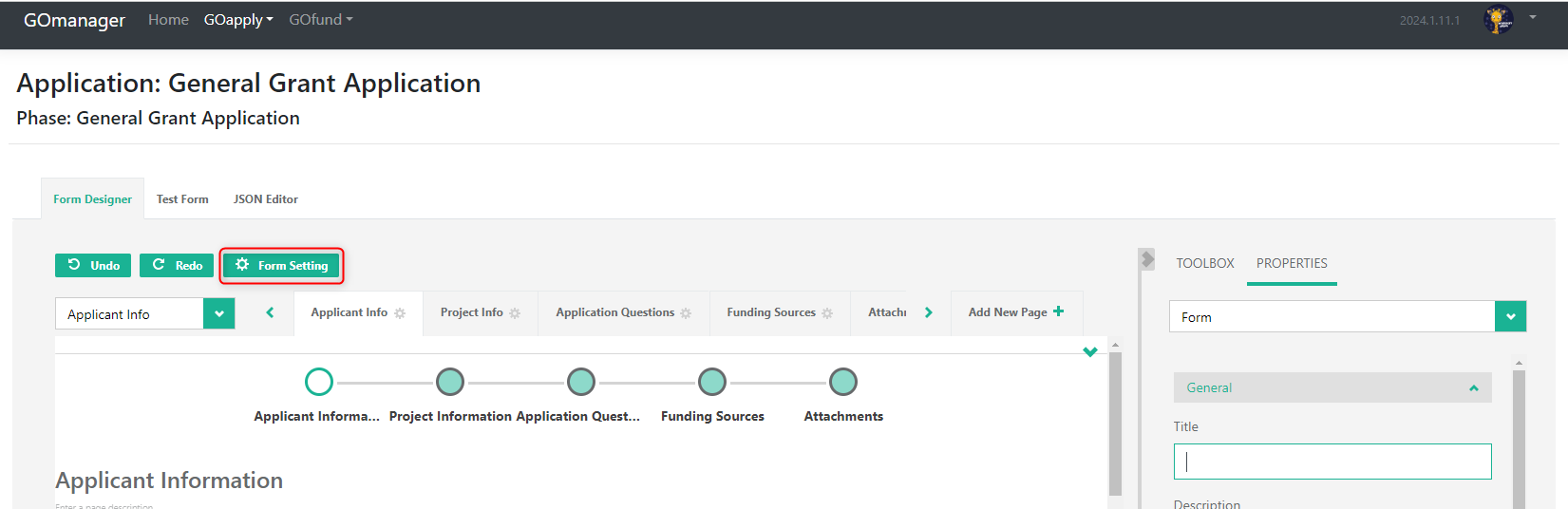
Form settings let you customize your phase as a whole. These settings apply to the entire phase. You cannot alter individual field settings from this area. Below, we will look at each form setting in more detail. Form settings are split into multiple sections.
- General
- Title: Name of the Phase
- Description: Phase Description if desired
- Show/Hide title: if checked, the Title and Description will be visible on the phase; if unchecked, they will not. Note that, if visible, the form Title and Description will be visible on each page of the phase. Think of these as a header and a subheader.
- Default language: If your phase language is not English, choose another option. This will default to English if nothing else is chosen.
- Mode (edit/read only): If edit, the form is editable. If the display form is not editable. This will default to Edit and should not be set to display, as applicants will not be able to fill out the form.
- Date Format: This property lets you choose a date format. It will default to mm/dd/yyyy. But you can also choose from dd/mm/yyyy or yyyy/mm/dd.
- PDF: Settings for PDF rendering. This is where you can adjust how the phase appears in the Submitted PDF. Please note that all PDF renderings will, by default, contain the phase name and applicant name at the top of the page.
- PDF HTML render as: Your choices are standard, auto, or image. We highly recommend keeping this set to "standard," as HTML fields will render strangely in the PDF version if the other options are selected.
- Navigation: these settings dictate how the applicants navigate the phase
- Page previous button text: Customize the “Previous” button on your phase
- Page next button text: Customize the “Next” button on your phase
- Complete button text: Customize the “Complete” button on your phase
- Question
- Question title location: determines where the title of each question is located. The top is standard.
- Question description location: determines where the description of each question is located. Under the title is standard.
- Question title pattern: controls where the required symbol is located
- The question required symbol(s): type a symbol to denote a required question. Will default to an asterisk *.
- Pages: here you can name and title your pages; you can also do so at the page level. Click Add New to add a new page. Use the waffle next to the page names to click and drag to rearrange pages.
- Data
- Clear invisible values: in order for invisible (hidden) fields to map correctly, this setting must be set to None.
- Validation:
- Focus on the first error: controls what happens when a user tries to continue or submit a form that has validation errors. When this setting is enabled, the user’s cursor (focus) moves to the first question that failed validation. This ensures the user immediately sees where the problem is instead of having to hunt through the form.
- Check errors mode: when should the phase check for errors (like required fields not filled in)? Choose an option.
- Show on Completed: Type your submission success message, or enter a URL to which the user will be redirected after submitting. You can also add conditions to the URL redirects.
- Navigate to URL: After submitting, the applicant will be redirected to the URL in this field. If empty, no redirect will happen.
- Show the completed page at the end (completedHtml) as an HTML field. Type what you would like the applicants to see when they submit the phase. If this section is empty, our default message will appear. This is what the default message looks like:
- Please note that the HTML field may look empty, but might contain some HTML code that doesn't appear in the field. To ensure the field is completely empty, click Source to remove anything from it.
- Please also note that, upon creating the phase, this field will default to the value "Thank you for completing the survey". Make sure to change or remove this message if you do not want it to appear.
- Navigate to the URL on condition:
- Completed HTML on condition:
- Timer/Quiz
- Show Timer Panel: position of the timer on the page
Page Properties
- General
- Name: used for conditional logic
- Title: appears at the top of the page
- Description: page description if desired
- Show to Applicant: If off, applicants will not see the page
- Read only: if on, applicants will be able to see the page, but not fill anything in
- Navigation title: this is what will appear in the navigation bar
- Navigation description: will appear under the title in the navigation bar
- Logic: add or edit page-level branching logic using if-then statements
- Layout: allows you to change the location of various elements to change the look of the page.
Field Properties
Select a field and click Properties from the menu. Property options on the Field level are more robust. Let’s look at the elements. And keep in mind the properties differ from field type to field type.
- General
Name: used for conditional logic
Title: Appears on phase
Description: appears under the title of the phase, giving applicants more information on how to answer the question
Show to Applicant: turn off to hide the question from the applicant. This setting overrides the Is required setting. This setting is beneficial to use in conjunction with Default Values. See the Data section for more information. Please note that when this property is off, the question will also be hidden from reviewers.
Is required? Turn on to require a response. If Required is on, applicants will not be able to move from the page without answering.
Read only: if on, applicants will be able to see the question, but not fill in an answer
Input type: will restrict the alphanumeric keys they can input. For example, if your question is “Number of people served,” and you want to ensure applicants can only enter whole numbers, change the Input type to number. More information on formatting is included in the Input Format and Input Mask section below.
For questions with an Input type of number, you can also set additional parameters, such as the Min, Max, and Step:
The "Step" setting determines the increment value for number fields, controlling how much the value increases or decreases when using spinner buttons or arrows. For example, setting the step to 1 restricts input to whole numbers, while 0.1 or 0.01 allows decimals to the tenth or hundredth place.
If the step is set to .5, only values matching that increment (like 3.5, 4.0, 4.5) are accepted.
Input placeholder: This will appear in the field before the applicant has input anything. Once the applicant starts typing in the field, the placeholder will disappear.
Auto unmask: more info in the section below
Show mask when hover: covered in the section below
- akoyaGO: This is the section where you will set up mapping for your fields. More information in the Mapping section below.
Target entity and Target field: This is where you’ll map the entity and field.
Target View: If your question is mapped to a lookup field in CRM, you can choose to create the question as a Panel OR a Single Input Question Type to display the options from the related table as a list. Dropdown questions cannot map to lookup fields in akoyaGO.
If mapping to a lookup field and using a Single Input Question, you will need to choose a Target View from a list of the views on that table. For example, if you are mapping to Request > College (which is a lookup on Constituent), then you can choose from all the views in the Constituent table. As you can see below, I now have the ability to choose from my views on Constituent.
From the applicant side, it will appear as a drop-down listing all constituents in your chosen view. The image below shows a question mapped to a lookup field using a single input question and Target View from the applicant’s perspective.
*Please note the Target View will not appear in the Test Form within GOmanager Form Builder; you must test in the GOapply UI as a GOapply User to confirm this view is appearing as intended. For more information on testing, please see GOapply Testing Best Practices.
This is often the method used when mapping to the Program field (which is done by setting the Target Table to Request, the Target Field to Program, and the Target View to Active Programs (or any System View with the subset you want displayed to the applicant)).
- Hide from Reviewer: check to hide from Reviewers. If selected, the question will not appear on the reviewer’s PDF. Please note that is Show to Applicant property is off, the question will also be hidden from reviewers.
- Lookup Field: check this box if the field is mapped to a unique record identifier. For example, an organization's EIN is commonly used as a Lookup Field with a panel. This must be used in conjunction with entity and field mapping. When the Lookup Field is checked, GOapply will look for records that match the Lookup Field and update them with the information, rather than creating a new record.
- Overwrite Field: if checked, applicant response will overwrite the information in that field in akoyaGO. This property must also be used in conjunction with entity and field mapping.
- Tooltip: add additional information about the field. This will display as a text bubble when the mouse hovers over the question.
- PDF: turn ON Pdf is page break if you want the PDF to page break after this question.
- Logic: add or edit field-level branching logic. Remember this utilizes the field Name, so make sure your fields all have Names so you can find them easily.
- Layout: elements in this property change how the field visually looks.
- Page: drop-down to choose which page to work on
- Start new line: if checked, each Field will start a new line
- Title location: Change the location of the field title. Default is top left.
- Description location: change the location of the field description. Default is under the title, but above the input.
- Error location: Where the red validation message is rendered relative to the question.
- Indent: the higher the number, the more indented the field
- Min width: minimum pixels wide
- Max width: maximum pixels wide
- Size: the higher the number, the longer the input
- Data
- Default value: sets an answer automatically. This is helpful when you want to set specific value. This is often used with mapped, hidden questions - allowing you to set information in akoyaGO behind the scenes - for example, to set a default Program or Title.
- If setting a default value for a lookup field (like Program, High School, etc.) you have two options:
- Default value: sets an answer automatically. This is helpful when you want to set specific value. This is often used with mapped, hidden questions - allowing you to set information in akoyaGO behind the scenes - for example, to set a default Program or Title.
Option 1 - Dynamic Panel
If you will be displaying this value to the GOapply User, this is the method typically used.
1. Insert a Dynamic Panel mapped to the lookup field on Request. For more information, please see Dynamic Panels section below. Make sure to disable "Create new if not found" in this scenario.
2. Insert a read-only single input question mapped to the related record's identifying field. Set this question as the "Lookup" (more information on this included in Dynamic Panels section.) This question is what you will use to set the default value. For example, if I wanted to set a default value for Program, the panel would be mapped to Request- Program, and the single input question would be mapped to Program - Name.
3. In the Data tab (of the single input question's properties), set the Default Value to the value that should appear in that field. For example, the Program Name.
Option 2 - Single Input Question with GUID
This method is often used when hiding the question from the GOapply User, as it does not require a Dynamic Panel. However, if you are hiding the question setting the Default Value from the GOapply user, you can choose whichever option is easier for you.
1. Drag and Drop a Single Input Field
2. Target Entity: Request Target Field: Lookup Field (Program)
3. In the Data tab, set the Default Value to the desired Label(Program)::GUID
A “GUID” is the record Number that is found in the URL of a record which is the 16 digits found after the table name ID =
In the example above, my default value would be set to Arts, Culture::c9960713-f7db-eb11-bacb-002248205ab1
- Validation
- Required error text: if you would like applicants to see a particular error message if this field is required and they neglect to fill it in, input that here.
- Maximum length: This setting works for the Comment question type only. Enter a number that will serve as the max. length for the field. Applicants will see this number relative to the text they’ve entered on the phase.
Input Format and Input Mask
Input format and input mask let you specify a required format for entries in a field. For example, if you want applicants to input their phone number as (123) 456-7890, then your input format would be (999) 999-9999. Nines in the input format indicate that any digit between 1 and 9 is acceptable. Input formats and input masks autofill the field in the format that you determine. As in the example above, applicants would just enter the numbers, and the input format would insert the parentheses and dashes.
Upon mapping, the Input Type will autoset to match the data type of the akoyaGO field. For example, mapping to a date field will auto-set the Input Type to Date, and mapping to an integer field will auto-set the Input Type to Number, and it will set the minimum and maximum, if appropriate.
- Input Type: In GOapply, it exists as a dropdown menu. The options are date, number, and text. As stated above, this will auto-fill upon mapping a field. If using a Date type field, the minimum date that can be set is 1/1/1900. GOapply submissions will not accept a date earlier than 1/1/1900.
- Input Format: Input format is a text field where you can indicate the format (i.e., 99-9999999 for Tax ID or (999) 999-9999 for a phone number). Pound signs (#) signify that both text and numbers are accepted. Phone number is not an option for the Input Mask. If you want to format a phone number, please use Input Format 999-999-9999.
- Input Mask: In GOapply, it exists as a dropdown menu. The options are currency and decimal.
Auto Unmask
Your form may contain fields whose values should have a specific format. To ensure that users enter values correctly, you can add input masks to these form fields. The expected value format will appear in light grey in the field before any data is entered. If the format should be preserved in the akoyaGO mapping, it is important that you uncheck the "auto unmask" field
Troubleshooting issues with PDF formatting on HTML question types
If formatting in the final PDF is cutting off words/pictures, you can try adjusting the "PDF HTML render as" option in the GOmanager Form Settings.
Force a Whole Number
If you need to force a field to accept only whole numbers, follow these steps. However, if you are mapping the numbered question to a number field in CRM, go to page 23 – Mapping to a Numbered Field. In the question’s properties, drop down the Validation section and fill it in as such:
- Click the + in the Validators section and choose expression from the drop-down.
- In the Expression section, type this: text: "The value should be an integer",
- expression: "{question_id} notcontains '.' and {question_id} notcontains ','"
Mapping
It is important to remember that you can only map what exists in your CRM. If there is an element of your phase that you want to map that doesn’t exist as a field in your CRM, you will need to add that field. If you need assistance adding a field, create a case in our GOsupport portal. Make sure you’ve completed the Pre-Work Checklist before you start mapping.
Target Entity: choose the Entity that contains the field you’d like to map to from the dropdown. This should always be a request.
In the akoyaGO section of the field properties, choose the field you’d like to map to from the drop-down. The dropdown will only contain fields that exist in the entity you chose.
A note on field mapping: if you are mapping a field to akoyaGO, the character limit must be less than or equal to the character limit on the field in akoyaGO. A System Customizer user can find field lengths in Power Apps. For more information, please see System Customizer Video - Column Properties or MS Learn - Create Field & Max Length.
akoyaGO CRM fields that are picklist (choose one) or multi-option picklist (choose multiple) will automatically map to the appropriate field type and read the options from the CRM, populating them accordingly. For example, if you want to map to the Institution Type field on Constituent, drag and drop a single input field from the toolbox, map it to the field, and save. The question will automatically update to a dropdown and fill in with the options in CRM.
We are also providing you with an index of each default field and its maximum length.
DISCLAIMER: This is an index of fields in an out-of-the-box solution. To find the maximum length of a custom field, please follow the steps outlined above.
Quick note on mapping when using a fiscal sponsor: We recommend, as best practice, mapping the Tax ID field as a lookup field AND making it required.
Dynamic Panels exist in your Toolbox as a field type. Panels allow you to map to a record related to Request, such as the Request's Primary Contact, Applicant, or Payee. You cannot add fields (individual questions) within a panel until you map the entire panel itself. A panel should be mapped to a lookup field on the Request table. After dropping the Panel into your phase, choose a Target entity and a Target lookup field from the drop-down. For example, Request would be the Target entity, and Primary Contact or Applicant might be the Target lookup field.
*Please note that a panel mapped to Request - Applicant is not required, as the GOapply user identified the applicant constituent upon registration. Information for this constituent can be updated and maintained in the Organization Profile. However, if you want the applicant's information to appear on the PDF created upon submission, you may still choose to include an applicant panel in your phase.
Within the panel mapping, there is also a setting for "Child of Request."
Child of Request indicates that the panel represents a related child table (entity) of the main Request table. When enabled, the panel’s questions map to fields in a child record. Use Child of Request for panels that represent one-to-many relationships with the Request (e.g., multiple budget lines, payments/requirements). For panels mapped directly to a lookup field on the Request (like Applicant, Payee, Primary Contact), this setting should not be selected.
After mapping the panel, you can drag and drop additional questions into the Panel grouping.
Please note that the setting Create New if Not Found will default to true:
This means that GOapply will create a new record for the selected lookup field when the form is submitted. Make sure to uncheck this box if you do not want a new record created when none exists.
Within the panel, you will need to define at least one field as the lookup field. As mentioned above, this is the field akoyaGO will search to see if the related record already exists. For a Contact panel/lookup field, we recommend using Email Address, as this is the most unique identifier for an individual. For a Constituent panel/lookup field, we recommend using EIN/Tax ID AND at least one other matching value, for example, Constituent Name or City, to help distinguish between unique constituents that share a Tax ID/EIN (such as schools within a school district, departments of the same organization, etc).
Pre-mapped Panels
GOmanager is equipped with premapped dynamic panels. These live in your toolbox and cover everything from Fiscal Sponsor/Payee to Requirements. Simply drag and drop the panels into your phase. They will map to the subentity of Request to which they are assigned. These panels cannot be edited directly. Though these premapped dynamic panels include lookup fields, if you want to adjust them (for example, if you want to set more than one field as a lookup or use an alternate field), you will need to build your own panel.
Subentity Mapping
Using a dynamic panel, you can map to sub-entities of Request, such as Payment/Requirement, Outcomes, and Scholarships. In the akoyaGO section of Properties, check Child of Request, then map the fields inside the panel to the sub-entity of Request.
Map a Hidden Field
You can map to a hidden field the same way you would map to a non-hidden field. However, make sure the field is neither hidden nor read-only. If those conditions are met, the mapping will break, and the field will not map back to the CRM.
Map to a Numbered Field
If you are mapping a question that requires a numeric answer (example: SAT score, class size, or class rank score), GOapply will fetch the field requirements from CRM and apply them to the question. Meaning, if it needs to be a whole number in the field it's being mapped to, then it will force it to be a whole number. Or, for the class rank score, if it must be a number between 0.00 and 1.00, it will not accept answers outside that range. Applicant will see an error in the field describing what the value should be if they go outside the range.
Test Phase
When you’ve finished adding fields and editing elements, you can quickly see how this phase will look and flow from the applicant’s perspective from the Test Form tab. You can choose to include visible elements and even switch the view between devices. Please note that this does not replace actual testing of a phase before opening it to applicants. For information on testing, please see GOapply Testing Best Practices.